In the previous article on Index Investing we had seen the returns of the Nifty50 TRI over ROLLING 5 year, 7 year and 10 year periods for both SIP and Lumpsum investments starting from January 2000 until July 2021. Amongst other things, this analysis showed that if anyone investing for 7 years or more in the Nifty50, one managed to get a return>5% CAGR in almost ALL periods.
However, the analysis done above was ONLY for the Nifty50. A quick look at the NSE’s website shows that there are several more Broad Based Indices. Hence, in this post I will cover how the Nifty100, Nifty500 and the Nifty Nxt50 have performed as well as compare their performance with the Nifty50. I will be also covering the Midcap and Smallcap Indices in ANOTHER post.
METHODOLOGY
Even in this case, I have used the Total Return Index (TRI) for all the Indices above since it provides returns from dividends as well. In order to prevent cherry picking of starting and ending date, I have taken EVERY month from January 2003 until August 2022 and provided returns for every possible rolling Five year period, Seven year period, and Ten year period (just like the previous analysis). For e.g. January 2003 until January 2008 is the first five period, February 2003 to February 2008 is the next five year period…………August 2017 to August 2022 is the last five year period. Similar thing is done for 7 year and 10 year periods. Thus we get 176 Five Year Periods, 152 Seven Year Periods and 116 Ten year periods. Now, you can ask here why January 2003 and not January 2000 (as done in the previous analysis). This is because the NSE website provides data for Nifty100 TRI only from January 2003 onwards. Hence in order to make perfect comparisons, I have taken the starting point for ALL the indices from January 2003. You can also ask why I did not include the Nifty200 in this analysis. This is because the difference between the returns of Nifty200 and Nifty500 was very small and not worth the extra effort. More importantly, the NSE website provides data for the Nifty200 from January 2004 onwards (as opposed to January 2003 onwards for the Nifty100). I was already distraught at losing 3 years of data because of including the Nifty100 and if I included the Nifty200, I would have to lose one more year of data.
Also important to note that this analysis is done assuming that an investor has invested through the SIP route. I have assumed that the SIP investor will make the same fixed investment ONCE every month (on the last trading day of the month) and shall continue to do it for the entire time period without fail and shall liquidate his total investment at the end of the SIP. For e.g. Assume an investor who invests Rs 10,000/- every month in a SIP for 5 years (i.e. 60 months). In this case, the 1st investment would be in August 2017, 2nd investment would be in September 2017… and the 60th investment would be in July 2022. Thereafter, in August 2022, the investor would liquidate his entire position and the IRR is calculated and annualized.
With this nifty nitty-gritty out of the way, let see the results below. The results are presented through charts and while I have provided some basic commentary on them, the charts themselves are very visual and hence you can easily draw conclusions upon seeing them carefully.
RESULTS
GENERAL CHART
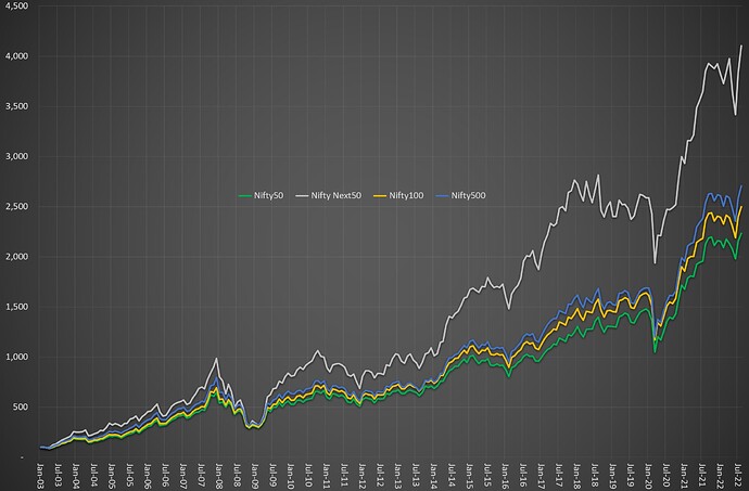
The above chart shows the performance of all the indexes starting from 31st January 2003 until 30th August 2022. As you can see both the Nifty100 and Nifty500 have outperformed the Nifty50. However, the Nifty Nxt50 has spectacularly outperformed ALL of the above Indices. If someone invested Rs 100 in January 2003 in these indices and withdrew the money in August 2022 then:
Rs 100 in Nifty Nxt50 became Rs 4102 (CAGR 20.9%)
Rs 100 in Nifty 500 became Rs 2704 (CAGR 18.3%)
Rs 100 in Nifty 100 became Rs 2499 (CAGR 17.9%)
Rs 100 in Nifty 50 became Rs 2233 (CAGR 17.2%)
While the above charts are useful to see the performance of the Indices, does it mean that Nifty Nxt50>Nifty 500>Nifty 100> Nifty 50 in ALL instances. The answer clearly is no. This is because the above chart shows the return profile of someone who invested in Jan 2003 and exited in August 2022. It does not give a CLEAR picture of returns for someone invested between these periods and/or for varying periods of time. It is for this reason we need to see the returns for rolling 5 year/7 year/10 year periods starting from Jan 2003
As a side note: If one is a long term investor and IF a mutual fund is in existence since several years, this method of seeing returns over rolling 5 year, 7 year (and if possible 10 year) periods is a better way of analysing performance of a mutual fund rather than cherry picked timeframes given by the funds. If such data is not available, then one can try to do the same for the fund manager.
EXCESS RETURNS OVER NIFTY50
5 YEAR PERIODS
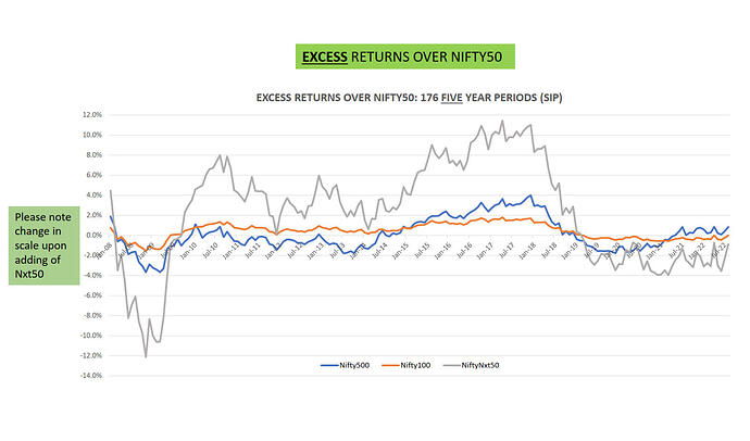
As stated earlier, we get 176 Five Year Periods starting from January 2008 until August 2022. The above image shows the EXCESS Returns of the Nifty100, Nifty500 and Nifty Nxt50 over the Nifty50. Some basic commentary on the above charts:
Nifty500: While the average excess return is 0.1%, it is not a meaningful number because there is a wide variation in excess returns (Std Dev: 1.6%) and also a wide range (7.7%). This index outperformed the Nifty50 in 47% of the periods. The key period of outperformance (wherein this index outperformed even the Nifty100) was December-2015 until August-2018
Nifty 100: The average excess return is 0.4%. The variation (Std Dev 0.8%) and range (3.4%) is both lower than the Nifty500. This index outperformed the Nifty50 in 69% of the periods.
Nifty Nxt50: The average excess return is 2.2% but as you can see there is a huge variation in returns (Std Dev 5.1%) and a high range (11.4%). However, the variation is more on the positive side. The index outperformed the Nifty50 in 65% of the periods. Interestingly, since March-2019, this index is underperforming the Nifty50. The key period of great outperformance was from October-2009 till October-2011 and also from May-2014 until December-2018
7 YEAR PERIODS
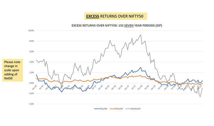
We get 152 Seven Year Periods starting from January 2010 until August 2022. Some basic commentary on the above charts:
Nifty500: The average excess return is 0.3%. However, the variation (Std Dev 1.1%) is higher than Nifty100 and the range (4.7%) is higher too. Crucially, the index underperformed the Nifty50 in 41% of the time periods
Nifty100: At the outset you can see that the index outperformed the Nifty50 in most of the time periods – 85% to be precise. The average excess return was 0.5% and the variation of returns (Std Dev 0.5%) is lower and with a lower range (1.8%) as well.
Nifty Nxt50: Even this index outperformed the Nifty50 in 86% of the time periods. The average excess return is 3.1% While the standard deviation (3%) and range (11.8%), I will gladly accept such variation/range as it so positively skewed. The key period of great outperformance was from March-2014 until April-2019
10 YEAR PERIODS
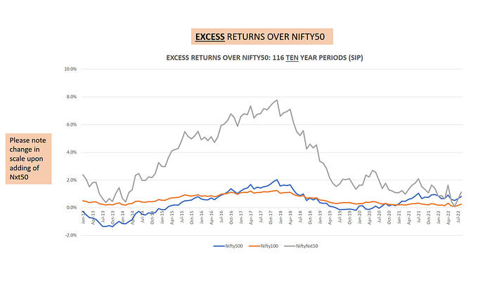
We get 116 Ten Year Periods starting from January 2013 until August 2022. Some basic commentary on the above charts:
Nifty500: The average excess return is 0.4%. However, the variation (Std Dev 0.8%) is higher than Nifty100 and the range (3.4%) is higher too. Crucially, the index underperformed the Nifty50 in 32% of the time periods
Nifty100: At the outset you can see that the index outperformed the Nifty50 in ALL time periods. The average excess return was 0.6% and the variation of returns (Std Dev 0.3%) is lower and with a lower range (1.1%) as well.
Nifty Nxt50: Even this index outperformed the Nifty50 in ALL time periods. The average excess return is 3.3%. While the standard deviation (2.2%) and range (7.7%), I will gladly accept such variation/range as it on the positive side. The key period of great outperformance was from May-2014 until April-2019 (almost the same period as that in the 7 year timeframe)
ABSOLUTE RETURNS
The chart shown earlier give relative returns i.e. Returns in EXCESS of the Nifty50. You can ask what the absolute returns for these 5 year/7 year/10 year periods. For that instead of throwing the basic statistics (average, min, max, std dev, skew, kurtosis, etc) at you I am presenting the same in the form of Cumulative Relative Frequency charts. The advantage of this chart over histograms (that I did in the previous analysis) is that histogram suffer from biases of the presenter (ME in this case!) as the range of the “bins” chosen by presenter decides the “look” of the histogram.
I have made a PowerPoint presentation for these charts. You can see the link on my BLOG
CONCLUSION
Upon doing the above study, we can say that Nifty Nxt50 > Nifty 100 > Nifty50 and more so from 7 year and 10 year periods. The Nifty500 is a mixed bag as it does outperform the Nifty50 in mostly majority of the times in these time periods but not to the same extent as the Nifty100 and Nifty Nxt50. One also wonders as to how the Nxt50 outperformed to the extent that it has but I do not have any answers as of now. The idea in this post was just to present the data. If I manage to get some reasonable theories, I shall update the post.
Since the above data is a presentation about the past, we can neither extrapolate the outperformance findings nor can extrapolate the generalized findings (that Nifty100 and Nifty Nxt50 are better than Nifty50) into the future and I humbly request you to be MINDFUL OF THE SAME.
| Subscribe To Our Free Newsletter |


