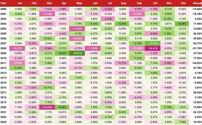
I keep a tab on my monthly portfolio returns (historical) like a heatmap. Here’s a sample below:
Then you track similar NIFTY50 and NIFTY500 or any other benchmark index and plot it in a line graph to give you the desired result.
Here’s a sample NIFTY50 return I got from PrimeInvestor:
I use premium Value Research Online (VRO) to extract my monthly returns (although accuracy is questionable) since I use Tijori (premium) as well which has a higher returns profile (not sure why – am investigating more on this).
So I used the lower CAGR returns for the graph (keeping the expectations low) to paint the picture.
PS – the NIFTY50 heatmap is very interesting if you see which months performed positively over the last 23 years and which didn’t. Something to ponder and keep our expectations in check.
Hope this is helpful ![]()
| Subscribe To Our Free Newsletter |


