Relative Rotation Graph
Relative Rotation Graphs are a visual tool used to analyze the relative strength and momentum of multiple securities against a common benchmark and each other. Developed by Julius de Kempenaer, RRGs simplify the comparison process by displaying all securities on a single chart, highlighting their performance trends over time.
RRG charts differ from other financial charts in that the horizontal axis does not represent time. The basis for an RRG chart is a scatter plot, with de Kempenaer’s Relative Strength Ratio indicator as the horizontal axis and his Relative Strength Momentum indicator as the vertical axis.
The Challenge of Traditional Relative Strength Analysis
Standard relative strength charts typically compare one security against a benchmark, resulting in multiple one-on-one comparisons when analyzing several securities. This approach can lead to information overload and makes it difficult to see the bigger picture.
For example, if you’re comparing the performance of various sectors against the S&P 500, traditional charts might not effectively showcase which sectors are improving or weakening relative to the benchmark and each other.
How RRGs Address the Challenge
RRGs plot multiple securities on a two-dimensional graph, divided into four distinct quadrants:
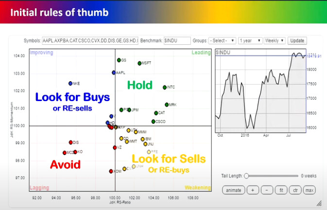
- Leading Quadrant (Top-Right): Securities here exhibit strong relative strength and positive momentum against the benchmark. They are in a relative uptrend and are expected to outperform.
- Weakening Quadrant (Top-Left): Securities have strong relative strength but negative momentum. They may start to underperform as their momentum wanes.
- Lagging Quadrant (Bottom-Left): Securities show weak relative strength and negative momentum. They are in a relative downtrend and are likely to underperform.
- Improving Quadrant (Bottom-Right): Securities have weak relative strength but positive momentum. They might be in the early stages of an uptrend and could soon outperform.

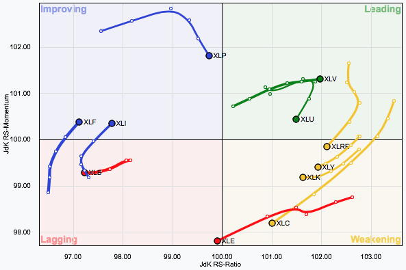
The unique feature of an RRG is that each symbol is plotted as a dot with a “tail” extending backward. The tail shows you the history of the symbol’s position in the past. You can use a slider to control the length of the tail and dynamically scroll through history.
Each dot on each symbol’s tail represents one period – anywhere from 1 month to 5 minutes, depending on the “Period” setting. The large dot at the end of the tail represents the current RRG values for that ticker symbol. Those values are updated continually throughout the current trading week; however, new dots are only added at the start of a new week.
-
Leading (Green). Strong relative strength and strong momentum
-
Weakening (Yellow). Strong relative strength but weakening momentum
-
Lagging (Red). Weak relative strength and weak momentum
-
Improving (Blue). Weak relative strength but improving momentum
As you can see in the example above, stocks typically progress through the quadrants clockwise. The color of each line is determined by the color of the quadrant where the line ends. The width of each stock’s line is determined by the ending dot’s distance from the center of the plot.
Interpreting the Rotational Movement
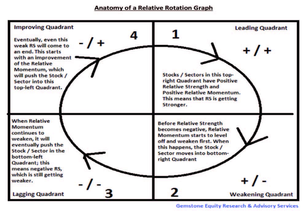
The movement of securities on an RRG is typically clockwise, reflecting the natural rotation between the quadrants:
- From Leading to Weakening: A security may start losing momentum but still maintains strong relative strength.
- From Weakening to Lagging: Continued loss of momentum leads to weaker relative strength.
- From Lagging to Improving: Momentum picks up, but relative strength is still weak.
- From Improving to Leading: Both momentum and relative strength are strong, indicating a potential outperformer.
Using RRGs for Investment Decisions
RRGs can help investors:
- Identify Trends: Spot which sectors or stocks are gaining or losing strength relative to the benchmark.
- Make Allocation Decisions: Allocate resources to securities in the Leading quadrant and consider reducing exposure to those in the Lagging quadrant.
- Time Entries and Exits: Use the rotational patterns to determine optimal entry and exit points based on momentum shifts.

Interpreting RRGs with Indian Market Examples
Let’s consider the major sectors within the Nifty 50:
- Nifty Bank Index (Banking Sector)
- Nifty IT Index (Information Technology Sector)
- Nifty FMCG Index (Fast-Moving Consumer Goods Sector)
- Nifty Pharma Index (Pharmaceutical Sector)
- Nifty Auto Index (Automobile Sector)
By plotting these indices on an RRG against the Nifty 50 benchmark, investors can visualize how each sector is performing relative to the market and each other.
Thought for 6 seconds
An Introduction to Relative Rotation Graphs (RRGs) in the Context of the Indian Stock Market
Investing in the stock market requires analyzing various sectors and stocks to identify where opportunities lie. Traditional methods of comparing individual securities can be cumbersome and may not provide a holistic view of the market dynamics. Relative Rotation Graphs (RRGs) offer a solution by visually representing the relative performance of multiple securities against a common benchmark and each other. This article introduces RRGs with a focus on the Indian stock market.
What Are Relative Rotation Graphs?
Relative Rotation Graphs are innovative tools that plot multiple securities on a single chart, showcasing their relative strength and momentum over time. Developed by Julius de Kempenaer, RRGs help investors identify the rotation of money between different sectors or stocks, making it easier to spot emerging trends.
Challenges with Traditional Relative Strength Analysis
In the Indian stock market, investors often compare the performance of various sectors like IT, Banking, FMCG, and Pharma against benchmarks like the Nifty 50 or the BSE Sensex. Traditional charts require multiple one-on-one comparisons, which can be time-consuming and may not reveal the broader market movements.
For example, comparing the Nifty IT index with the Nifty FMCG index individually against the Nifty 50 might show their performance relative to the benchmark but won’t highlight how they perform against each other.
How RRGs Simplify Analysis
RRGs address this challenge by plotting all selected sectors or stocks on a single graph divided into four quadrants:
- Leading Quadrant (Top-Right): Securities here have strong relative strength and positive momentum against the benchmark, indicating they are outperforming the market.
- Weakening Quadrant (Top-Left): These securities still show strong relative strength but are losing momentum, suggesting a potential slowdown in performance.
- Lagging Quadrant (Bottom-Left): Securities in this quadrant have weak relative strength and negative momentum, indicating underperformance.
- Improving Quadrant (Bottom-Right): These securities exhibit weak relative strength but positive momentum, signaling potential future outperformance.
Interpreting RRGs with Indian Market Examples
Let’s consider the major sectors within the Nifty 50:
- Nifty Bank Index (Banking Sector)
- Nifty IT Index (Information Technology Sector)
- Nifty FMCG Index (Fast-Moving Consumer Goods Sector)
- Nifty Pharma Index (Pharmaceutical Sector)
- Nifty Auto Index (Automobile Sector)
By plotting these indices on an RRG against the Nifty 50 benchmark, investors can visualize how each sector is performing relative to the market and each other.
Example Scenario:
- Leading Quadrant:
- Nifty IT Index: The IT sector, driven by companies like TCS and Infosys, is outperforming the Nifty 50 with strong momentum due to increased global demand for IT services.
- Weakening Quadrant:
- Nifty FMCG Index: FMCG companies like Hindustan Unilever may still show strong relative strength but are losing momentum due to rising input costs.
- Lagging Quadrant:
- Nifty Auto Index: The auto sector might be underperforming due to supply chain disruptions and decreased consumer demand.
- Improving Quadrant:
- Nifty Pharma Index: Pharmaceutical companies could be gaining momentum due to increased healthcare spending but haven’t yet started outperforming the benchmark.
Using RRGs for Investment Decisions
1. Identifying Sector Rotation
RRGs help investors identify sector rotation in the Indian market. For instance, if the Nifty Pharma Index moves from the Improving to the Leading quadrant, it may signal a good time to invest in pharmaceutical stocks.
2. Stock Selection within Sectors
Within a promising sector, RRGs can also be used to compare individual stocks. For example, within the Nifty IT Index, you can plot stocks like TCS, Infosys, Wipro, and HCL Technologies to see which ones are leading.
3. Timing Entries and Exits
- Entry Point: Consider investing when a sector or stock moves from the Improving to the Leading quadrant.
- Exit Point: Consider reducing exposure when a sector or stock moves from the Leading to the Weakening quadrant.
Practical Application Steps
Step 1: Select Your Universe
Choose the sectors or stocks you want to analyze. For the Indian market, this could be the major sectoral indices or top stocks within those sectors.
Step 2: Choose a Benchmark
Common benchmarks are the Nifty 50 or BSE Sensex. The choice depends on the composition of your selected securities.
Step 3: Plot the RRG
Use financial platforms or software that support RRGs. Input your selected securities and benchmark to generate the graph.
Step 4: Analyze the Quadrants
- Leading: Consider increasing exposure.
- Weakening: Monitor closely for signs of further decline.
- Lagging: Avoid or reduce exposure.
- Improving: Watch for potential investment opportunities.
Step 5: Monitor Regularly
Market dynamics change, so it’s essential to update your RRG periodically (e.g., weekly or monthly) to stay informed.
Considerations and Limitations
- Supplementary Tool: RRGs should be used in conjunction with other analysis methods, such as fundamental analysis and other technical indicators.
- Market Conditions: External factors like economic policies, global events, and currency fluctuations can impact performance.
- Data Availability: Ensure you’re using up-to-date and accurate data for reliable analysis.
References:
Julius de Kempenaer Articles:
https://stockcharts.com/articles/rrg/
Videos:
Why the Stock Market is SO Confusing Right Now
Why the Stock Market is SO Confusing Right Now
Julius de Kempenaer Discusses RRG Charts
Julius de Kempenaer Discusses RRG Charts
RRG: Navigating Strength and Momentum
Live Webinar: RRG: Navigating Strength and Momentum📈📉
Relative Rotation Graph LIVE Webinar Part 2: How to Use RRG in India Stock Market
Relative Rotation Graph LIVE Webinar Part 2: How to Use RRG in India Stock Market | Advance RRG
| Subscribe To Our Free Newsletter |


